
Product Design Safe Choix 2.0
Car safety research and comparison simplified
By making car safety ratings readily comprehensible, Safe Choix enables car buyers to make the safest choice possible within their budget.
TL;DR
Vehicle safety has long been my personal interest.
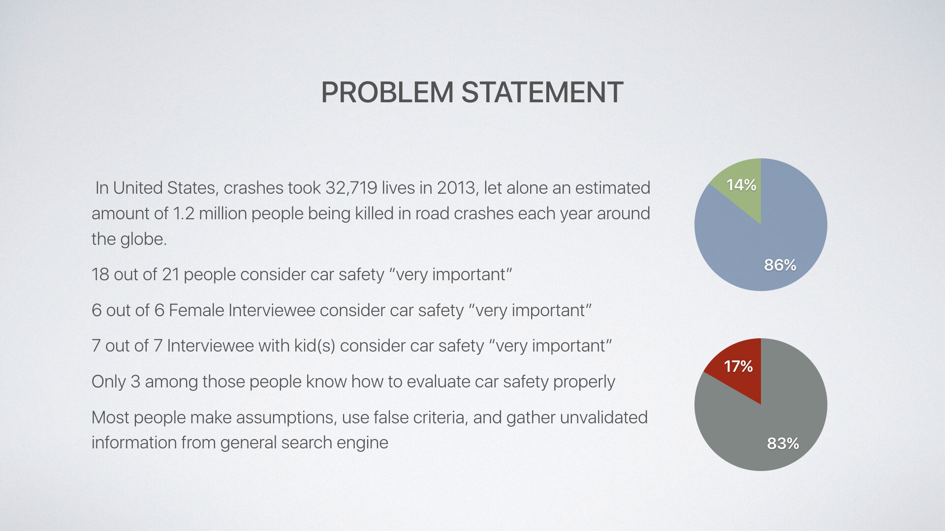
In 2019, more than 36,000 people died in motor vehicle crashes in the United States. In 2013, that number was only 32,719. Many of these crashes are preventable simply by having safer cars on road. In fact, the Transportation Department’s Office of Inspector General said it would audit oversight of U.S. vehicle safety standards due to growing fatality.
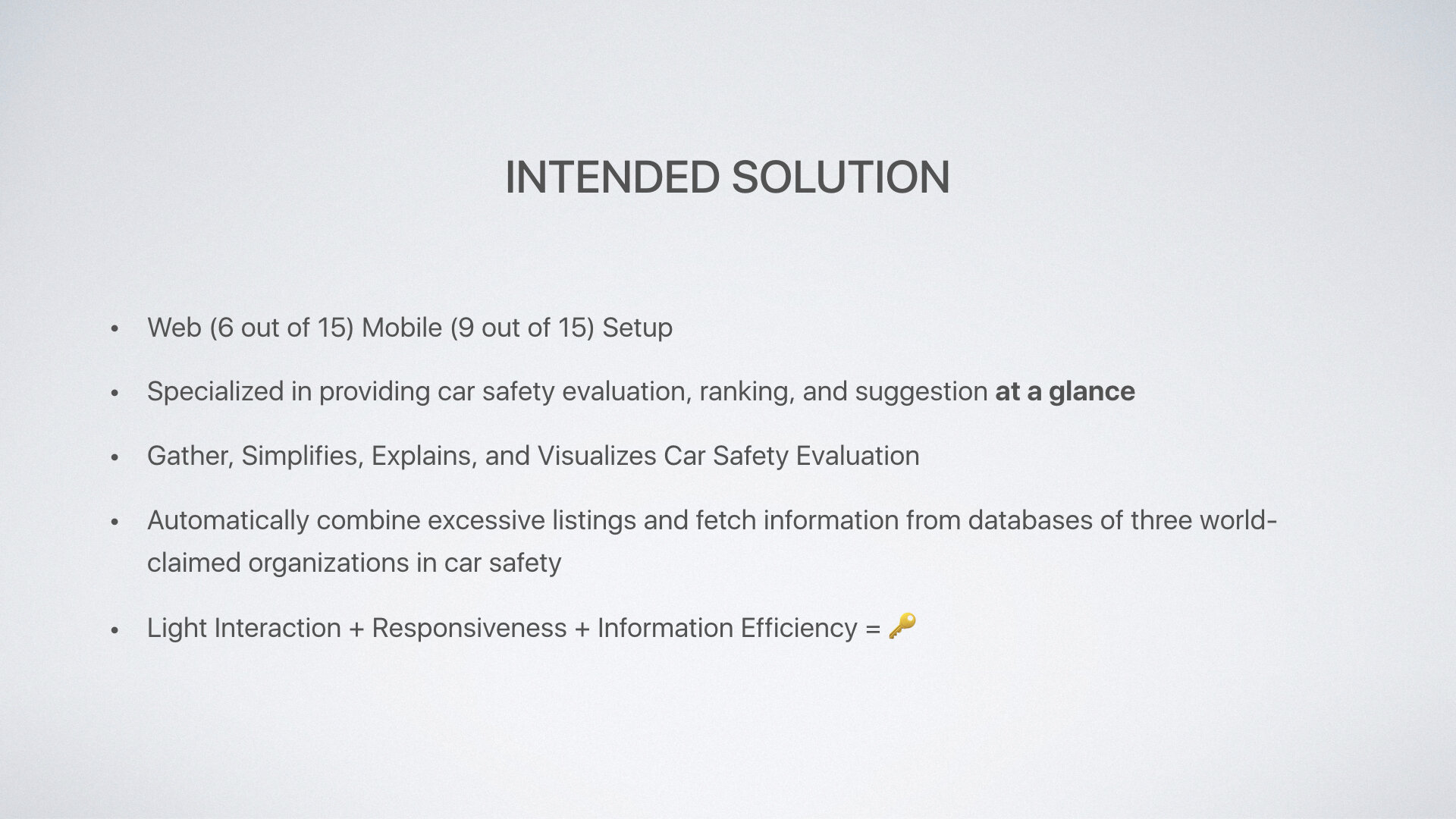
Safe Choix gathers and interprets safety ratings from New Car Assessment Programmes around the world to make car safety research simpler, easier, and more accessible. By making car safety ratings readily comprehensible, Safe Choix enables car buyers to make the safest choice possible within their budget.
The problem
I started Safe Choix as a passion project in high school when I discovered cars that failed crash test miserably were still flying off the shelf. I wanted to figure out a way for people to stop buying unsafe cars when there are safer options in the same price range.
There are three main issues with car safety research: awareness, fragmentation, and interpretation.
Awareness
Many buyers simply aren’t aware of what new car safety assessment programs are out there, hence do not include safety as a part of their research when shopping, assuming all cars available on sale today are safe to buy. On the contrary, the mandatory safety standard for a car to be on sale today is largely symbolic.
Fragmentation
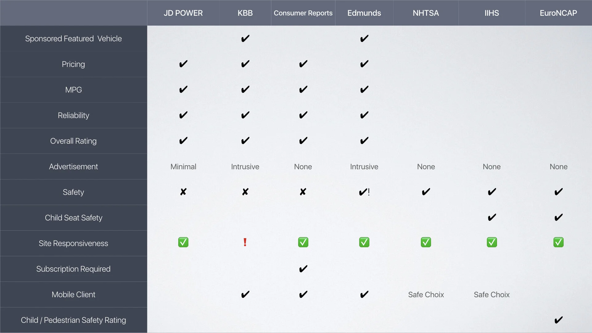
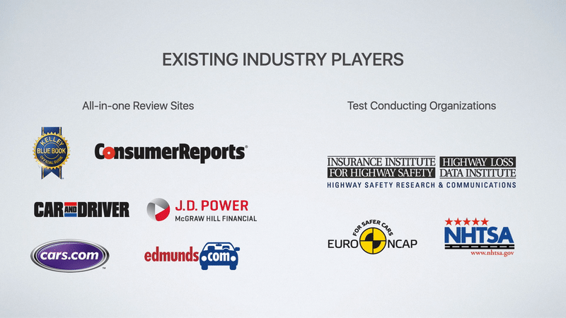
There are two new car assessment programs that give out safety rating on cars in the United States: IIHS (Insurance Institute of High Safety) and NHTSA (National Highway Traffic Safety Administration.) They use different standards and rating systems, making results incomparable. The two agencies also test different cars, resulting in certain car models having ratings given by both, others by one, and some none.
For vehicles also on sale in Europe, ratings from Euro NCAP (The European New Car Assessment Programme) are also applicable.
Fragmentation makes car safety research particularly difficult. Car buyers has to look up their choices through different agencies, figure out which agency actually tested their choices in mind, only to find out the results aren’t comparable between issuing bodies.
Interpretation
The ratings are only as good as the interpretation. Some programs use stars scale while other gives out letter grades. They also often include important information in the fine prints that aren’t communicated through the rating. Most importantly, results are only comparable within the same weight class of vehicles, which almost no car buyer is aware of.
A little history
The OG: Safe Choix 1.0
Safe Choix 2.0 is a redesign of my original Safe Choix app which I created in the summer of 2014, before senior year of high school. At 17, it was my first time using Sketch, first time designing an app, and first time working with a contract software developer remotely which turned out to be a hell ride. I managed to launch the app in September that year and received 1K download before the year end with a small iAd Workbench campaign.
I redesigned Safe Choix from the ground up in 2016 to bring it up to date to better fulfill the mission in helping people buy safer cars. The redesign took place concurrently with my summer intensive in UX design where I systematically studied user experience design ranging from understanding task flow and user stories to feature prioritization and the importance information architecture. With the adoption of the iterative design process, Safe Choix 2.0 is a more comprehensive, friendlier and deliberate design that further continues my mission from the start.
Discovery
Building on top of the online research and user feedback generated through the life cycle of Safe Choix 1.0, I focused on talking to real car buyers this time and get a grasp on the behavior to make evidence-based, not just heuristic decisions for Safe Choix 2.0.
Interviews
I went to the Bay Ridge, Brooklyn where many dealership concentrates to conduct in-person interviews to get a more in-depth look at how people shop for cars. I recorded basic demographic information, what car they drove, and asked them to rank three most important things they look for in a car and why.
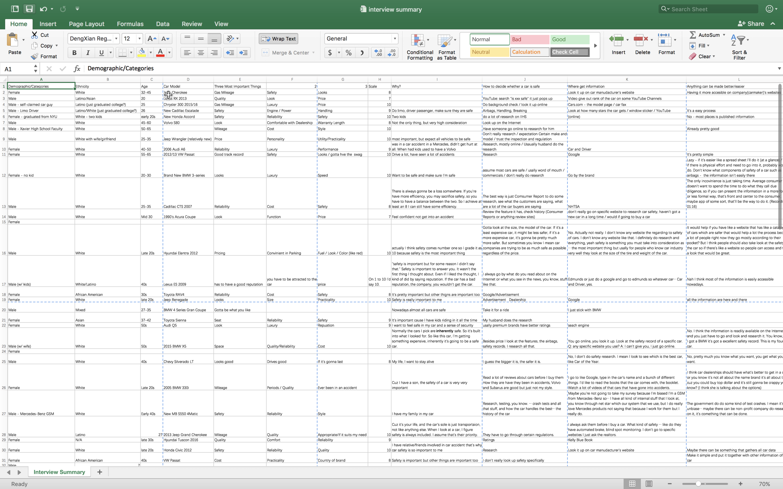
I specifically asked them how do they decide whether a car is safe to see what their existing safety research process is like, where do they get information on car safety to understand the sources, and if there is anything that can make the process better or easier, which now looking back the question would be better phrased as “is there anything frustrating about researching if a car is safe.”
After summarizing all the research input, the answer became quite clear. Most people (18 out of 21) find safety “very important,” however only 3 know how to evaluate car safety properly. Most people make assumptions (i.e. based on brand), use false criterias, and gather unvalidated information from general search engine rather than credible sources.
*A side note: it’s crazy how these interviews from 2016 on car safety projected the rampant misinformation that’s hurting democracy in 2020.
Initial Assumption
After User Research
Show them all information they should know
People would dig into the detail if the information were presented in an interesting way
People would probably use the universal search box most frequently
People want things simple and straightforward
Get the information they need quickly as possible (and get done with it)
Cluster-free and at-a-glance
App should do the research and thinking for them
User Flow
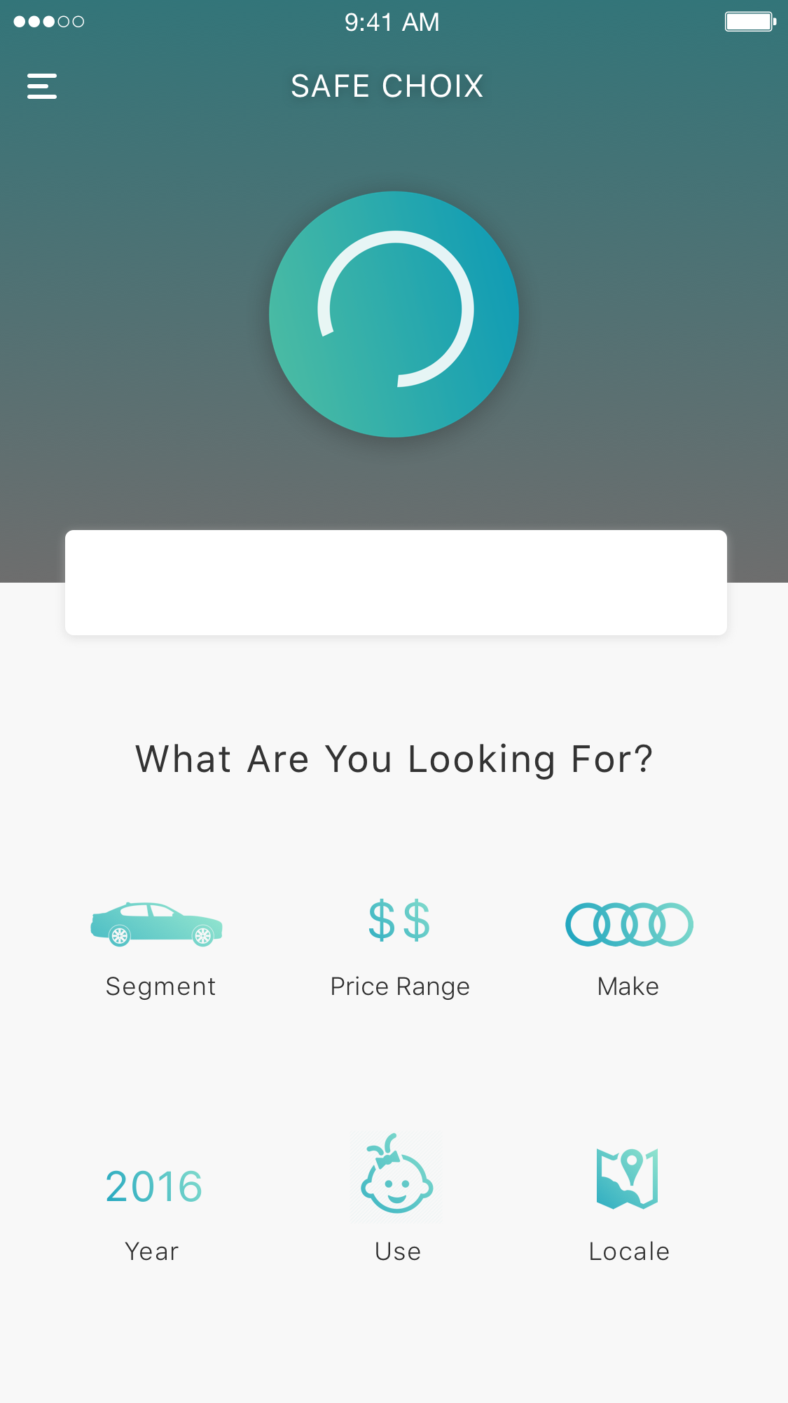
I reexamined the user journey of Safe Choix, refined user goal, and broke down the flow into three main steps: open, search, and get result.
I then synthesized possible scenarios based on interviews and surveys for each step, such as what specific intent car buyers often have in mind when they search for a vehicle, which are: a specific model, a specific budget, a specific segment, or a specific use.
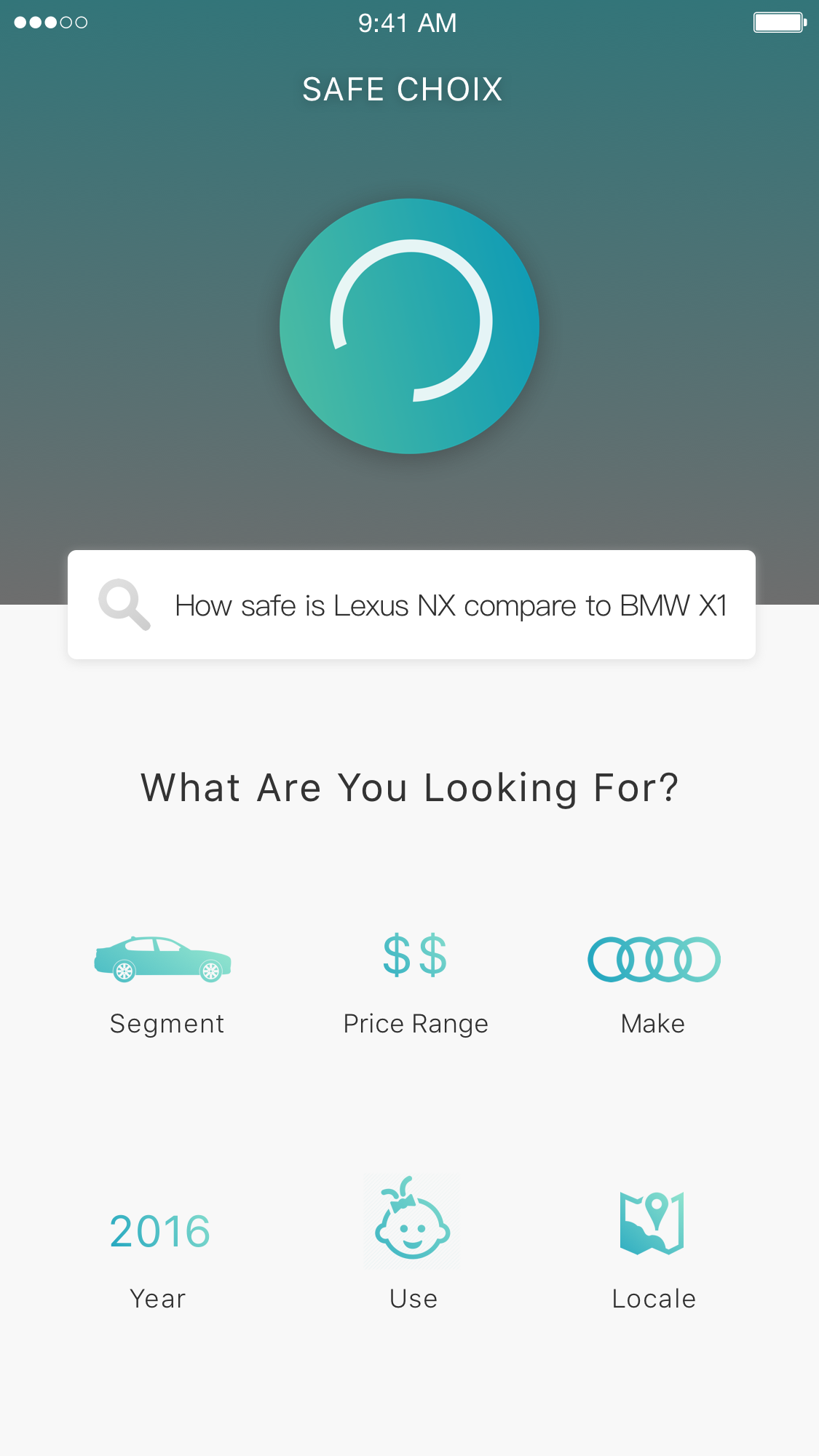
Each search on Safe Choix combines results of government-funded and non-profit crash tests, public information on safety features and options, organized by models based on the search query. The search can also be reinterpreted based on use cases on top of another search intent, such as the best car for drivers with babies within $30,000.
The result is then presented first in a simplified summary form for quick digestion and comparison, enabled by the Safe Choix Index, with option to jump into the detailed safety performance with a quick tap or swipe.

How people are researching car safety
“Take it for a ride”
Trust [government] inspection and regulation
“Don't really research”
“search ‘is xxx safe’ on YouTube and it just pops up”
“I always go by what do you read about on the Internet or what you see in the news, you know, stuff like that.”
“I guess the bigger it is, the safer it is.”
Walkthrough
Safe Choix 2.0
Safe Choix 2.0 integrates safety research into the car shopping experience rather than a standalone process that people have to go out of their ways to perform. The result is a comprehensive car shopping experience that guides car buyers each step of the way to find the safest vehicle that fits their needs.
New Home Screen: Simple but Almighty
The fully redesigned home screen takes care of all needs regarding car safety for prospective buyers. Either head straight to the shortcuts provided, or make use of the natural language omni search box for more complex inquiry. No matter what you have in mind, Safe Choix makes sure it's easily accessible with as few clicks as possible.
No sign up required
Safe Choix is designed as a convenient tool to find better and safer cars. Just open the app and start searching. It's that simple. It's designed to use Apple's CloudKit to sync your app data across devices and keep your data safe so there is no sign up required.

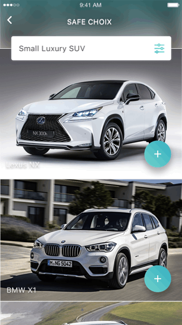
Home screen
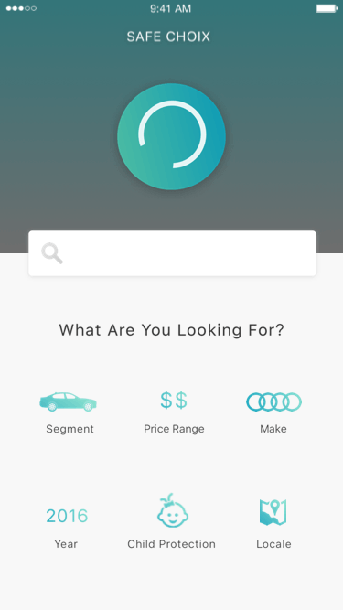
Search by price
Search by segment
Search by brand
So many ways to get there
Segment, Price Range, Make, or even Locale are all at your fingertips to sort out the safest choice of your next vehicle. New parents also have their shortcut for Child Protection, which weighs child occupant protection more than other criterias.
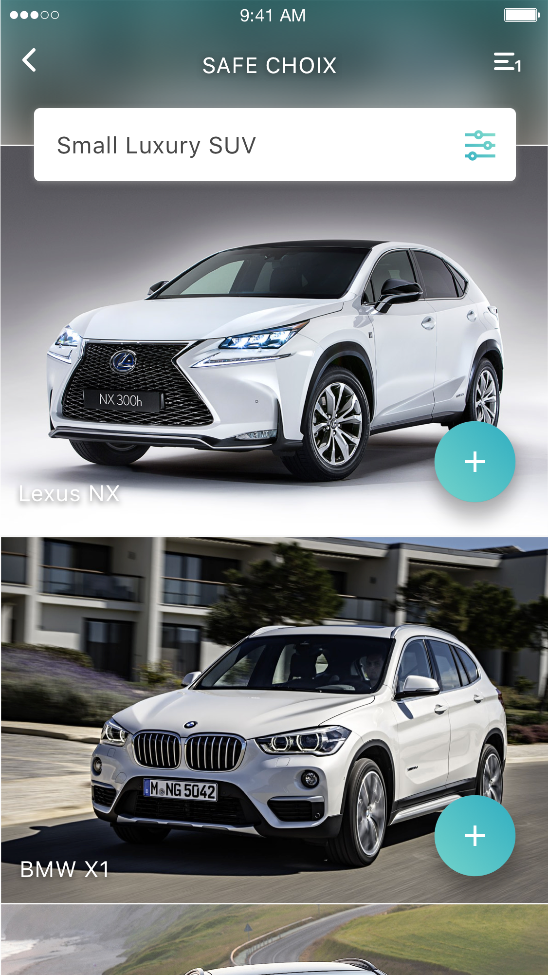
Smart recommendation
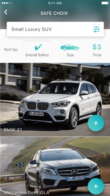
Car safety research shouldn’t need a PhD degree, and Safe Choix makes sure the search results reflect that: beautifully curated pictures with smart recommendation. Safe Choix's algorithm automatically bumps the safest model within the current result to the top so that users know which one is the safest right away.
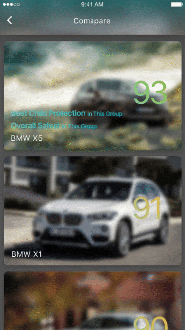
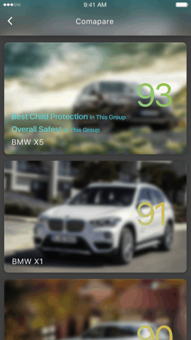
Sort and compare
If the initial search result isn't exactly what the user is looking for, the sort feature is just half an index finger away. Sort result by overall safety, vehicle size, price, release year, or child protection.
Once the user finds something they like, they can easily add it to the comparison basket through the conveniently located floating button at the bottom right of each model listing. The comparison basket is universal throughout the app so the user can compare any car, and autosaves when exiting the app so they can pick back up exactly where they left off.
Safe Choix Index is a calculated, comprehensive safety score that allows direct comparison between different vehicle segments, while the comparison basket contextually highlights important information within the comparison group.
Sort menu

Add to compare
Slide to delete
3D Touch enabled
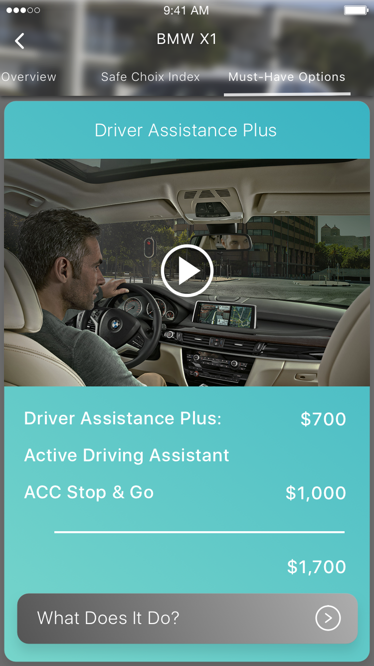
Passive + Active Safety
Two cars of the same model can be very different due to different configurations and options equipped. Many options and packages being offered by manufacturers can truly save lives and stop accidents before they happen, but sadly most of them are not standard equipments. Safe Choix makes sure car buyers take notice of these offerings through optimized interface layout that highlights and simplifies these essential information.
No math involved
Nobody (except mathematicians) likes math unless it’s necessary. From Safe Choix Index to the total cost of optional safety features, Safe Choix calculates everything on screen so the user doesn’t have to. That’s one less annoyance in the car research process.
Associative Suggestion
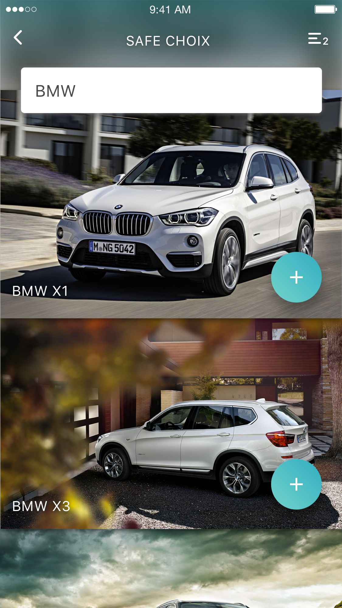
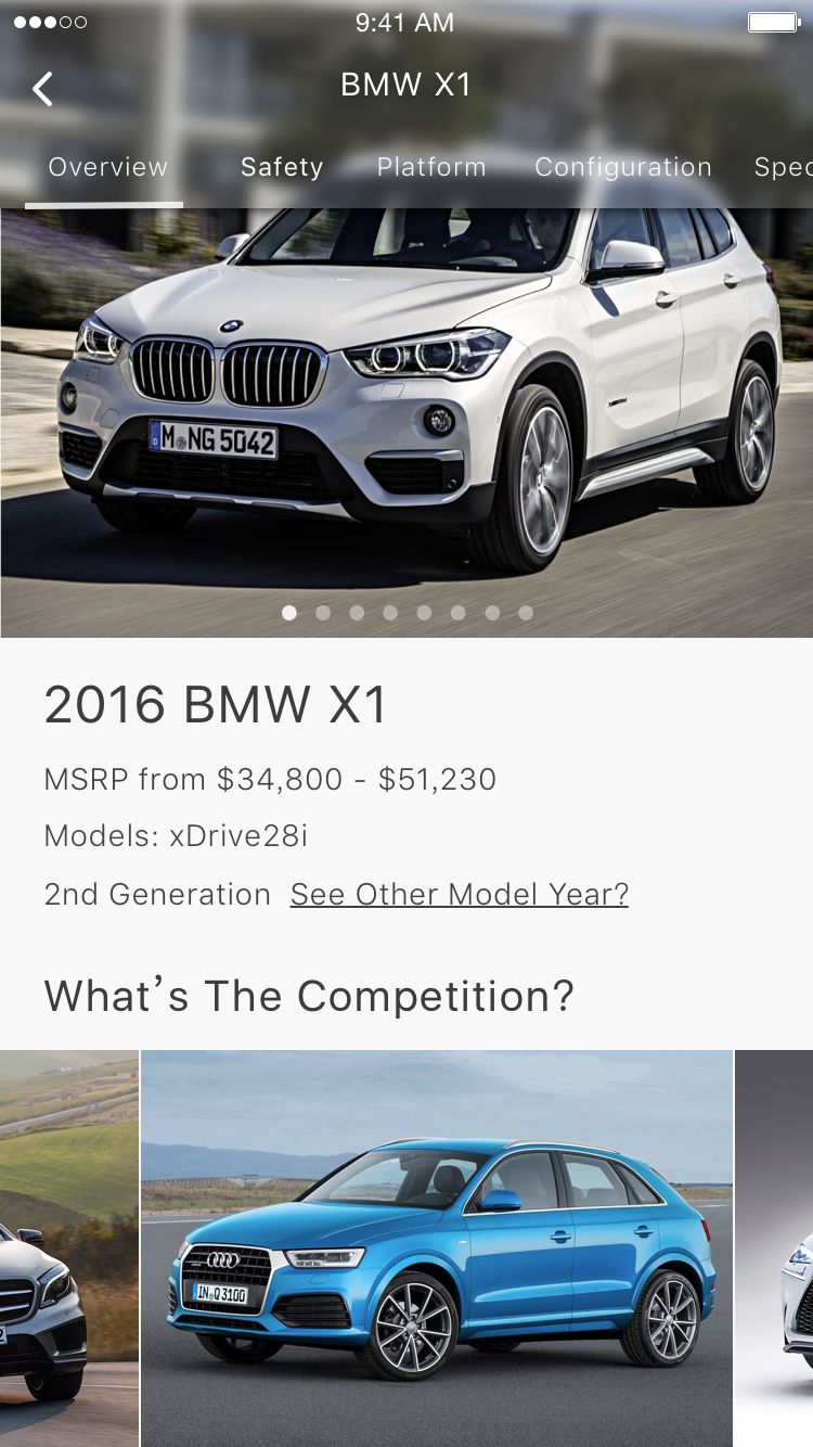
Comparison shopping is the widely utilized method in car buyers. Safe Choix automatically picks out relevant competitors of the selected model that are in the same segment for easy cross-comparison.
Child protection
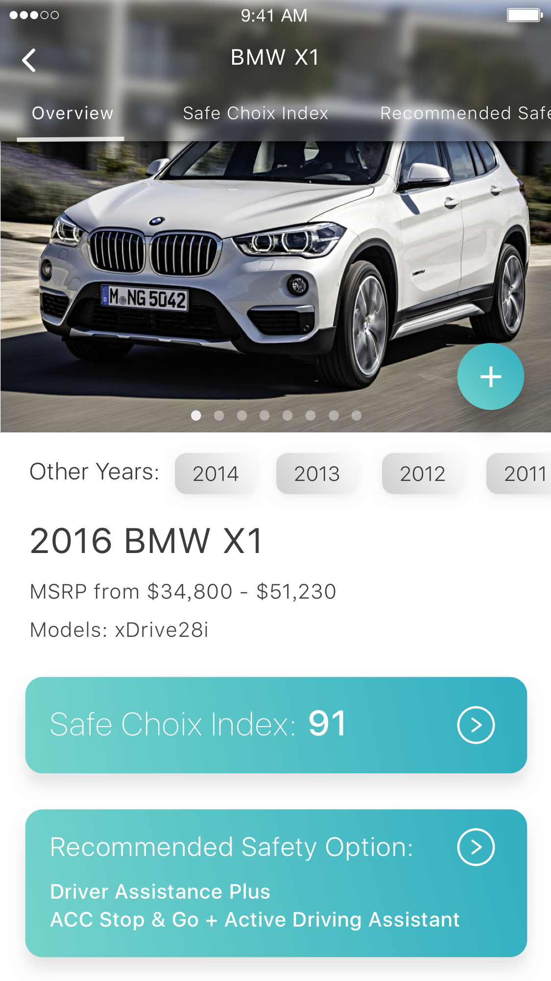
Model overview
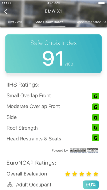
Safety Choix Index
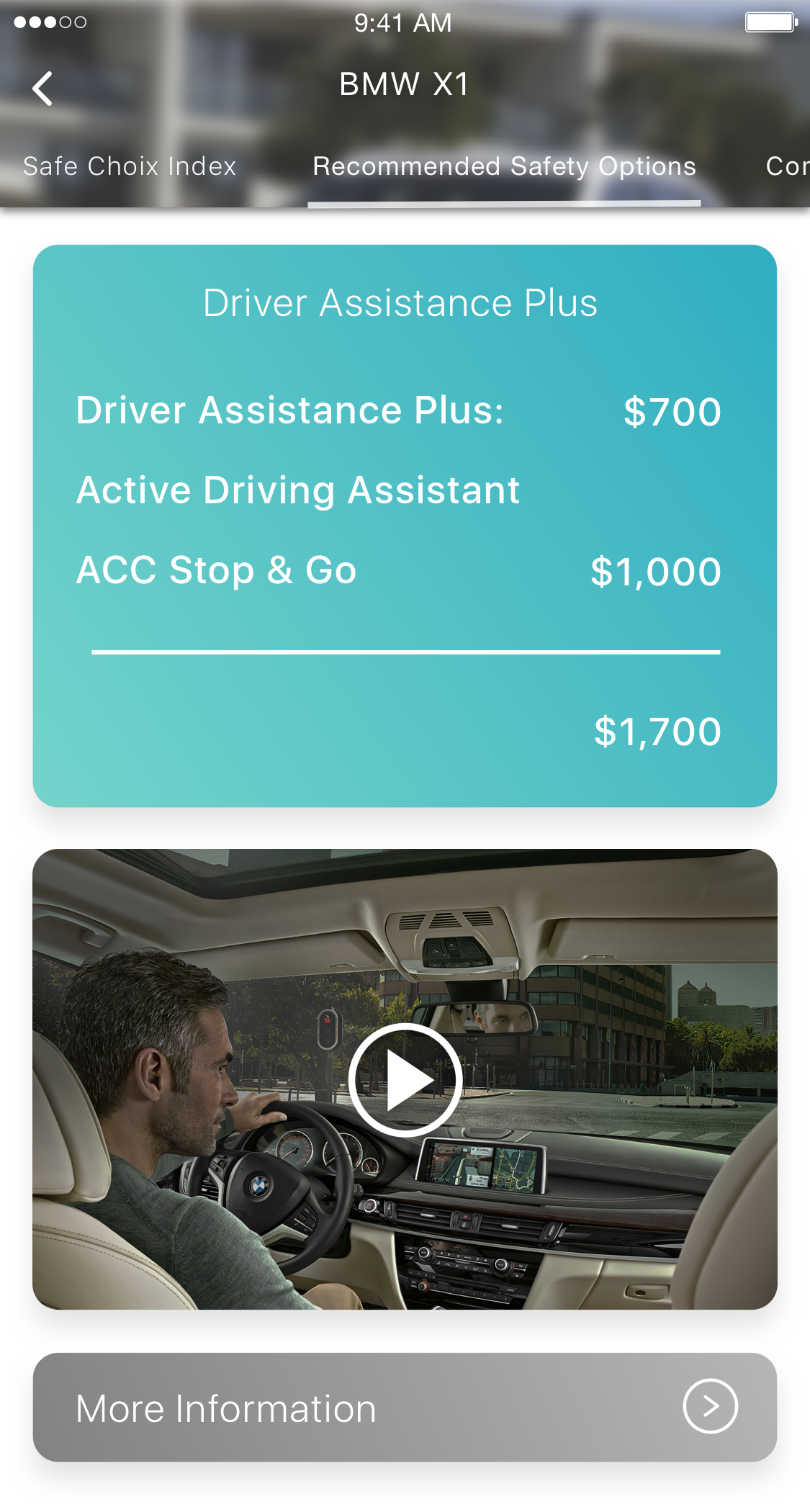
Safety options page
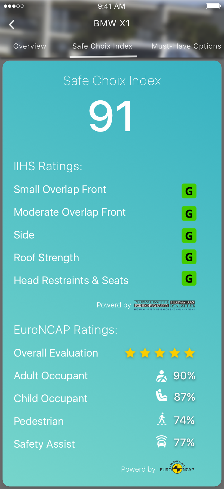
Safe Choix Index
Safe Choix Index is a comprehensive evaluation of a selected vehicle's safety performance. It combines ratings issued by multiple agencies to a single score and allows direct comparison between vehicles because it is a curved score. Because Safe Choix Index is so core to the credibility and experience of Safe Choix, I spent as much time refining this algorithm as the app design itself.
It takes all criterias below:
Basic Law of Physics: Size of the car and weight of the car
Intrusion Protection: all intrusion measure (the smaller the better)/1 + roof strength
Force Absorption: all dummy force measure (the smaller the better)/1 + whiplash rating
Adult + Child + Pedestrian Protection rating from EuroNCAP
Standard Safety Equipment: ESC, # of airbags, All-Wheel-Drive, AEB, BSM, etc
Optional Safety Equipment: Driver Assistance, Optional Airbag and Seatbelt Pretensioner
And combines them into a raw score. The requested raw score is then divided by the benchmark score (highest raw score ever recorded on Safe Choix) to receive the Safe Choix Index which is a percentage.
This means the safest car on Safe Choix at any given time would receive an 100, but when the highest raw score is refreshed by a safer vehicle, all vehicles will be re-divided by the new bench mark in result of a new Safe Choix Index. This way, the Safe Choix Index can remain an fair, objective, dynamic and comprehensive at-a-glance evaluation of car safety even as time moves on and technology advances.
Iterations
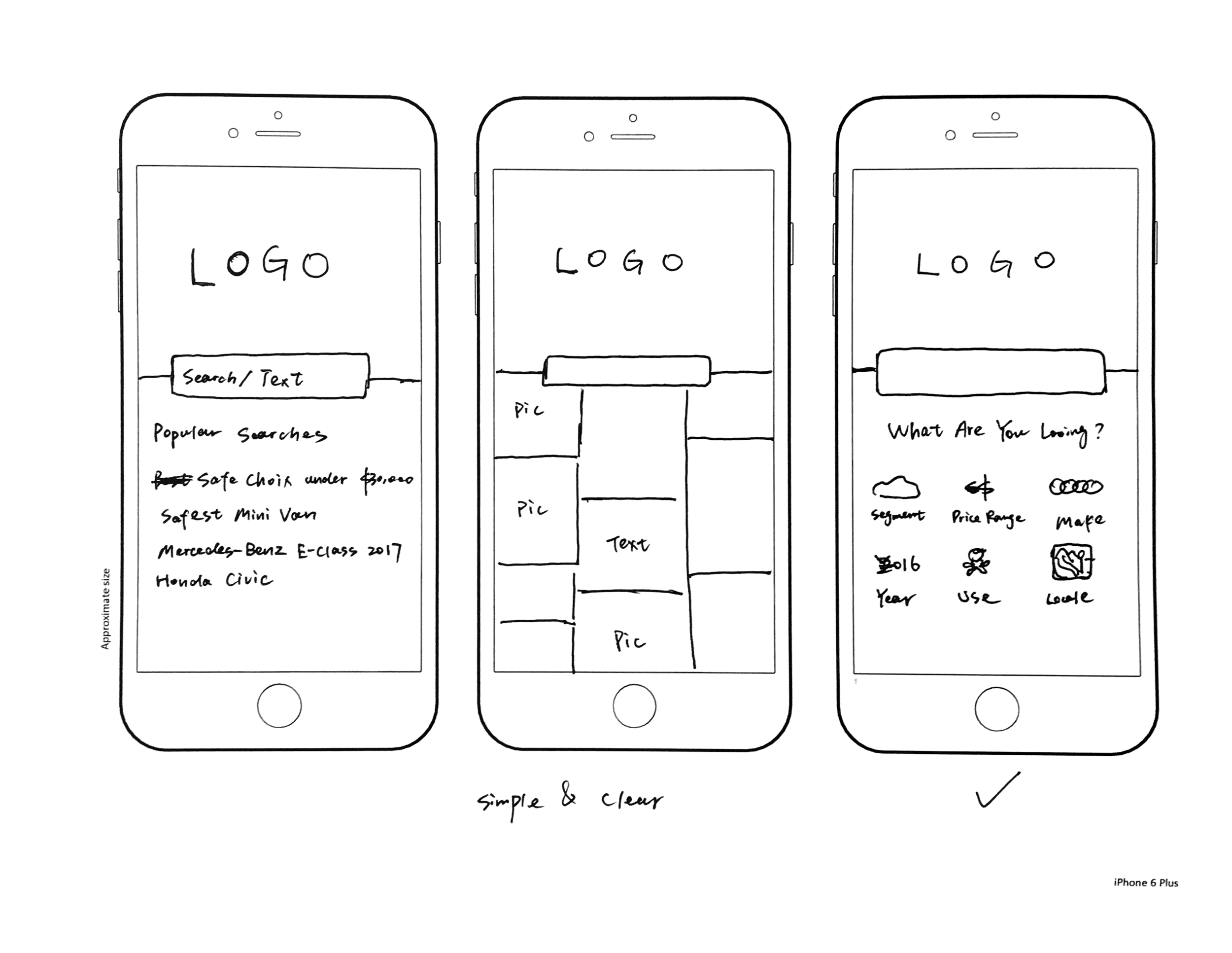
Sketches
For me, sketching is still the quickest way for me to iterate through the initial wireframing phase of turning ideas to screens. Sometimes I jot down different iterations of a screen and quickly gather feedback in a group setting to decide the best option before creating mockups in higher fidelity.
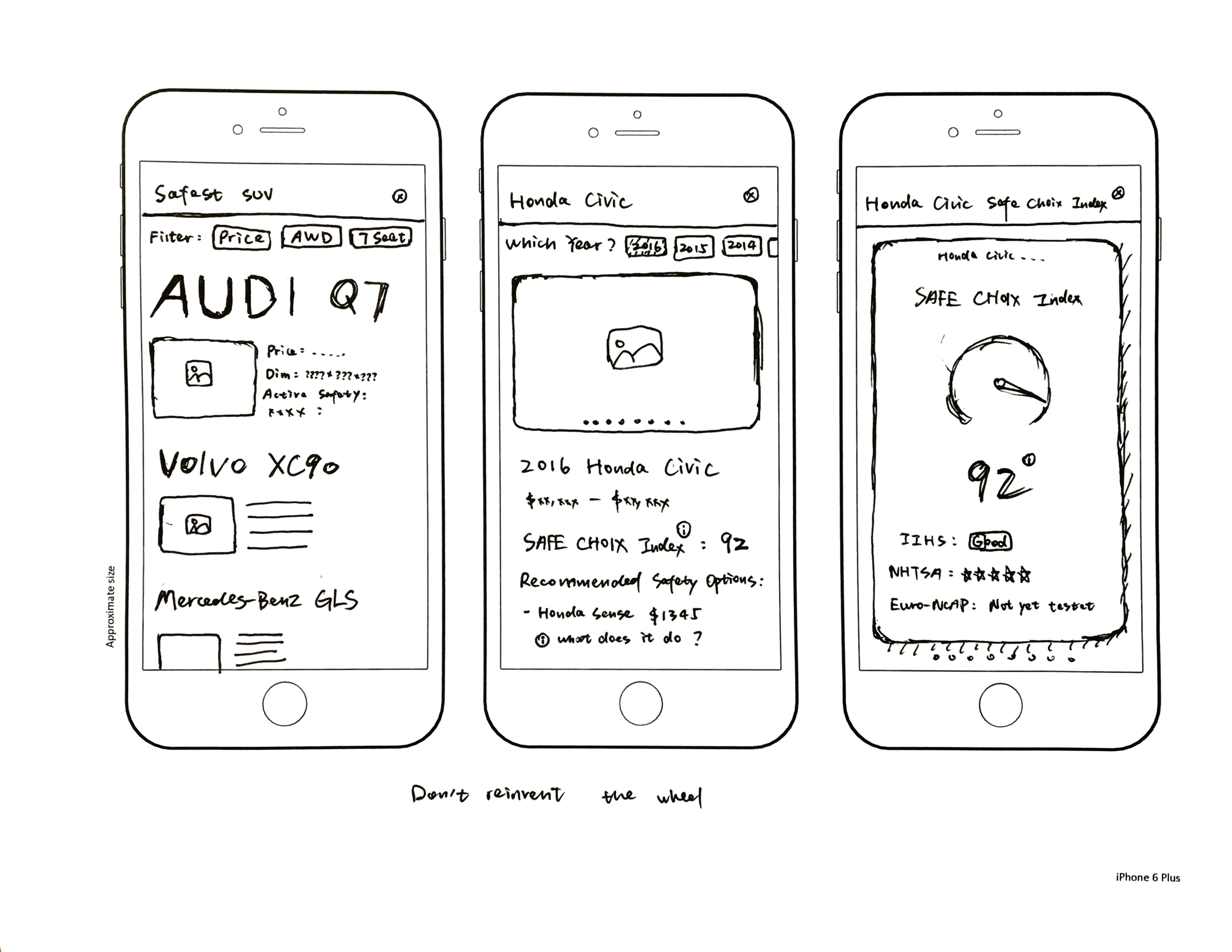

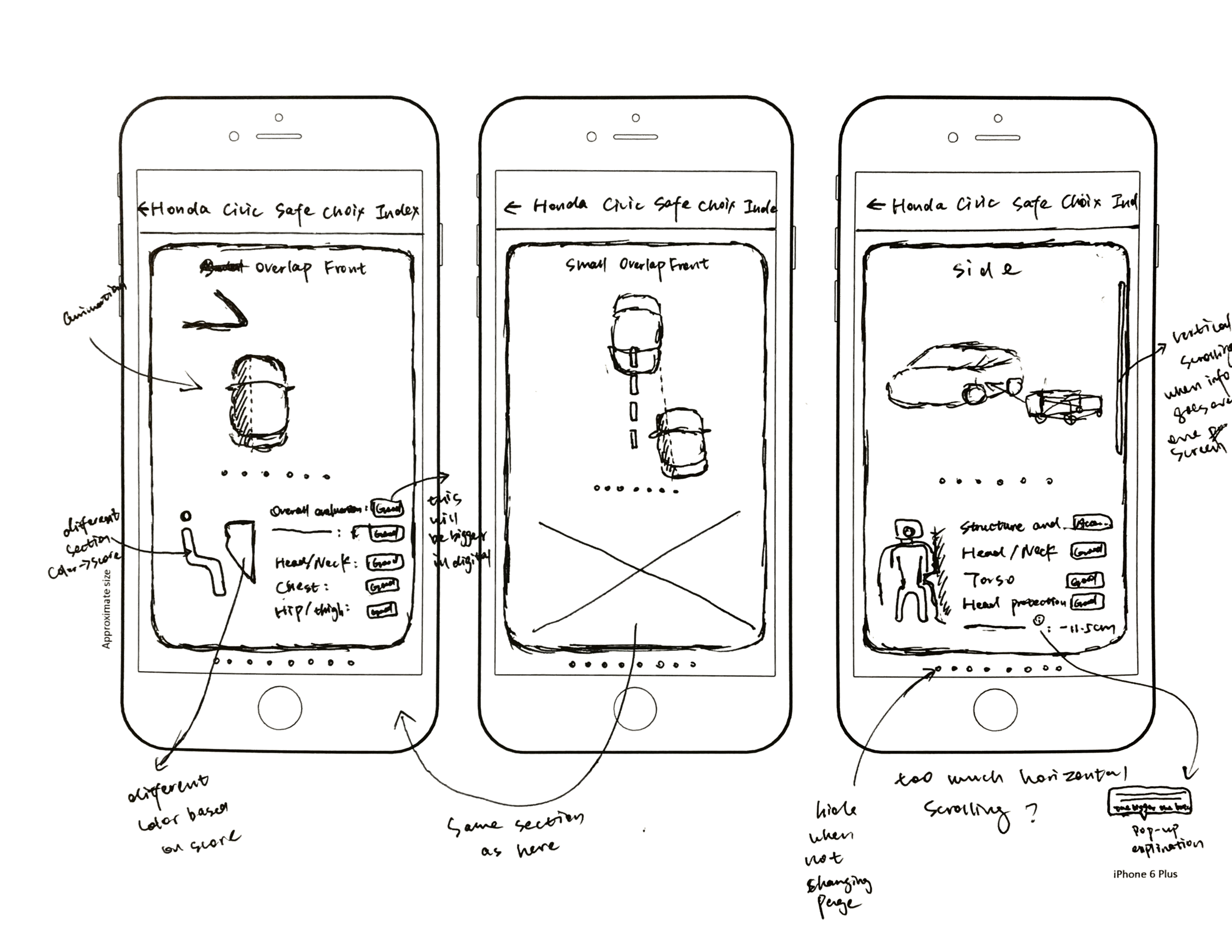
Medium to High-fidelity Mockups
After finalizing overall layout and finishing the ideation phase, I then headed over to Sketch and started putting together a digital wireframe so to iterate quickly on a more granular level. I conducted multiple usability testing sessions mostly focusing on affordance and readability, since not only I want the users to find what they want without much instruction or frustration, more importantly the information users find need to be easily consumable.
Old
New
Old
New
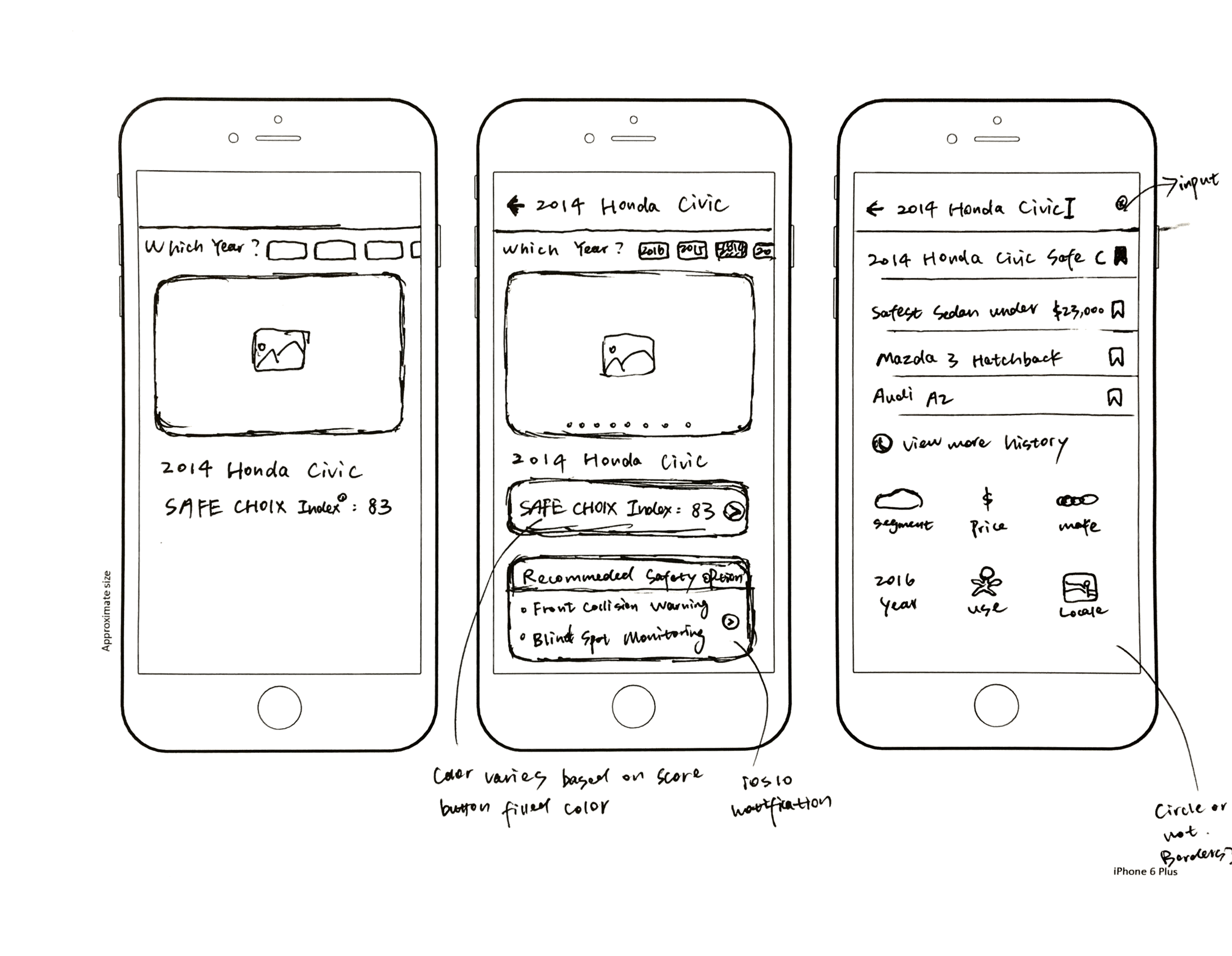
The app initially experienced affordance issues where users didn’t know if the white bar in the middle is a search field. I added the magnifying glass to indicate function and example search query to highlight the natural language processing capabilities.
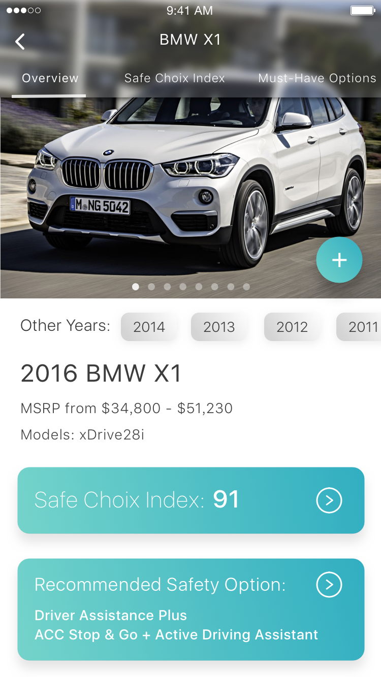
The model overview page also received a major overhaul. It didn’t make sense for similar models to take up so much prime screen real estate when the immediate previous page is mostly likely to be a search result page that already features these vehicles. Instead, a summary of the Safety Choix Index which gives a quick glance into the overall safety of the vehicle and recommended safety option took up the previously occupied space.
I made the model year selection directly visible on this page that efficiently uses the space through horizontal scroll. Having information on older models accessible is particularly important since U.S. sold 2.4 times as much used vehicle than new as recently as 2019.
First attempt
Second attempt

Final design
Final design (prioritized child protection)
The Safety Choix Index page is designed to be a detailed overview of all available safety information on a model from multiple sources. The initial design is heavily influenced by Safe Choix 1.0, the use of card design not only does not integrate well with rest of the app and wastes space, but the readability and contrast ratio are also less than ideal.
By removing unnecessary design and adding functional use of color, readability is greatly improved. With tweaked positions of iconography and added highlight to ratings, people were able to consume the page much faster.
A small detail can make all the difference, and that is the case for the added percentage scale. During my usability testing sessions, almost all participants were confused by what the number is for. Adding the percentage scale not only convey what the score is out of, but more importantly suggests it is a score in the first place.
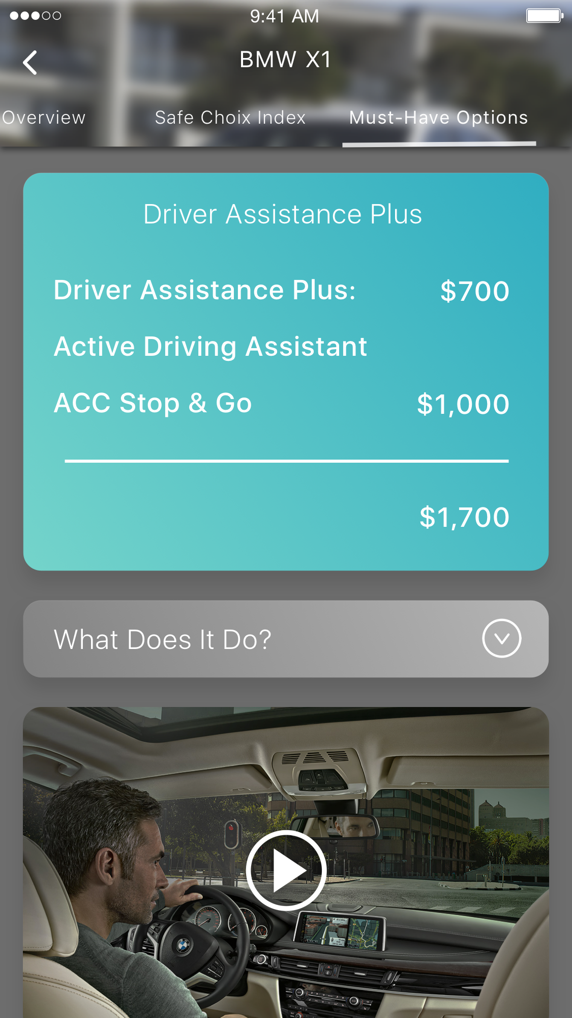

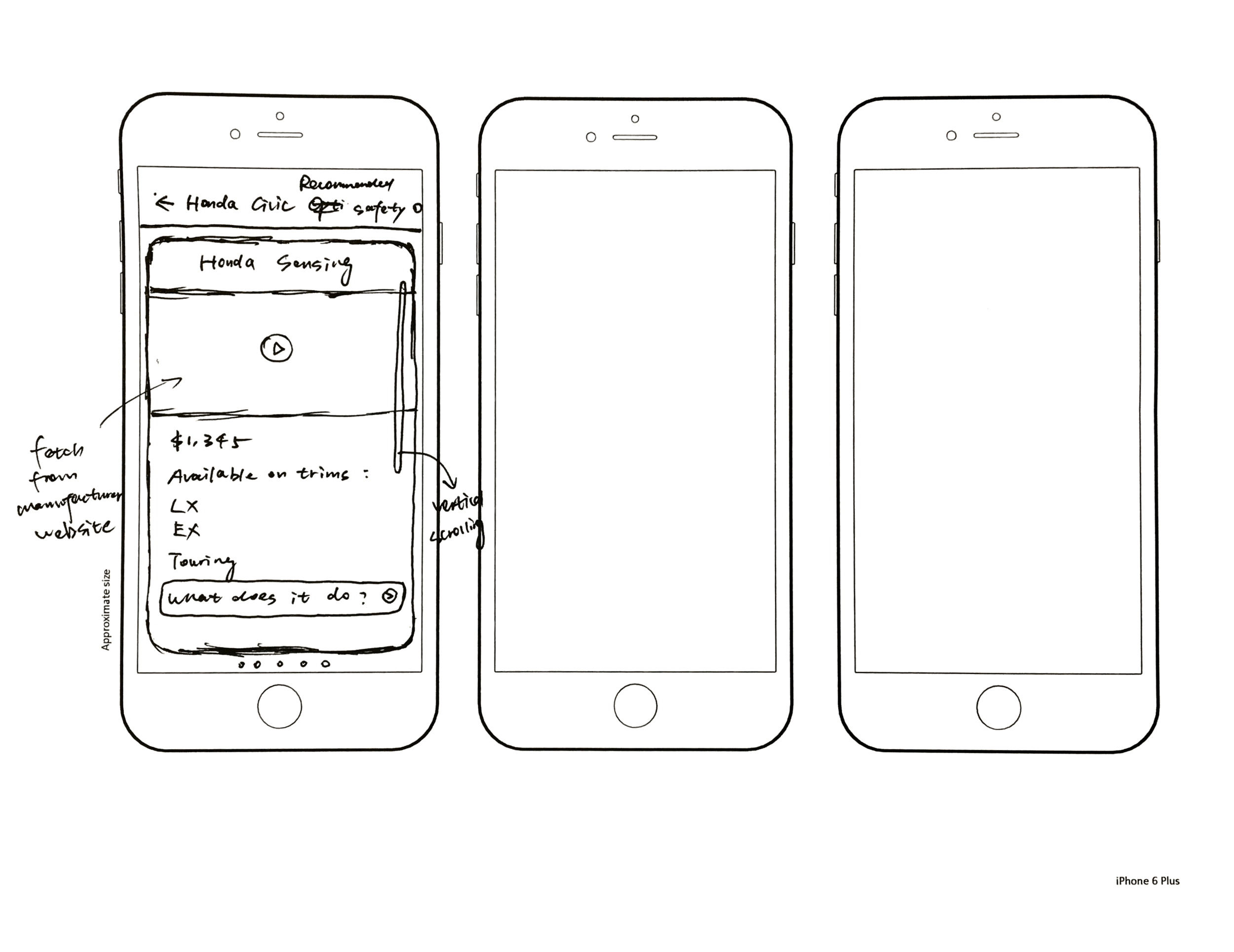
It is a similar story for the recommended safety options page. It did away with influence from Safe Choix 1.0 for a more functional design. I updated the copy from “what does it do?” to “more information” because it is a hyperlink that will take you to a browser, and “more information” conveys that expected behavior more appropriately. The direction of the arrow was also changed from down to right since it does not collapse and expand, but rather take you to another page.